Visual Guide
This section provides comprehensive visual representations, charts, and tables for portfolio-lib indicators and analytics.
Technical Indicators Visualization
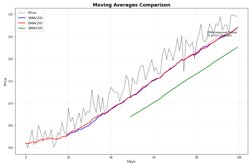
Moving Averages Comparison
import numpy as np
import matplotlib.pyplot as plt
import sys
sys.path.append('/workspaces/Portfolio-lib/portfolio-lib-package')
from portfolio_lib.indicators import TechnicalIndicators

# Generate sample price data
np.random.seed(42)
days = 100
trend = np.linspace(100, 130, days)
noise = np.random.normal(0, 2, days)
prices = trend + noise

# Calculate different moving averages
sma_20 = TechnicalIndicators.sma(prices, 20)
ema_20 = TechnicalIndicators.ema(prices, 20)
sma_50 = TechnicalIndicators.sma(prices, 50)

# Create the plot
fig, ax = plt.subplots(figsize=(12, 8))

# Plot price and moving averages
ax.plot(prices, label='Price', linewidth=1, alpha=0.7, color='black')
ax.plot(sma_20, label='SMA(20)', linewidth=2, color='blue')
ax.plot(ema_20, label='EMA(20)', linewidth=2, color='red')
ax.plot(sma_50, label='SMA(50)', linewidth=2, color='green')

# Styling
ax.set_title('Moving Averages Comparison', fontsize=16, fontweight='bold')
ax.set_xlabel('Days', fontsize=12)
ax.set_ylabel('Price', fontsize=12)
ax.legend(fontsize=12)
ax.grid(True, alpha=0.3)

# Add annotations
ax.annotate('EMA responds faster\nto price changes',
            xy=(75, ema_20[75]), xytext=(85, ema_20[75] + 5),
            arrowprops=dict(arrowstyle='->', color='red', alpha=0.7),
            fontsize=10, ha='left')

plt.tight_layout()
plt.show()
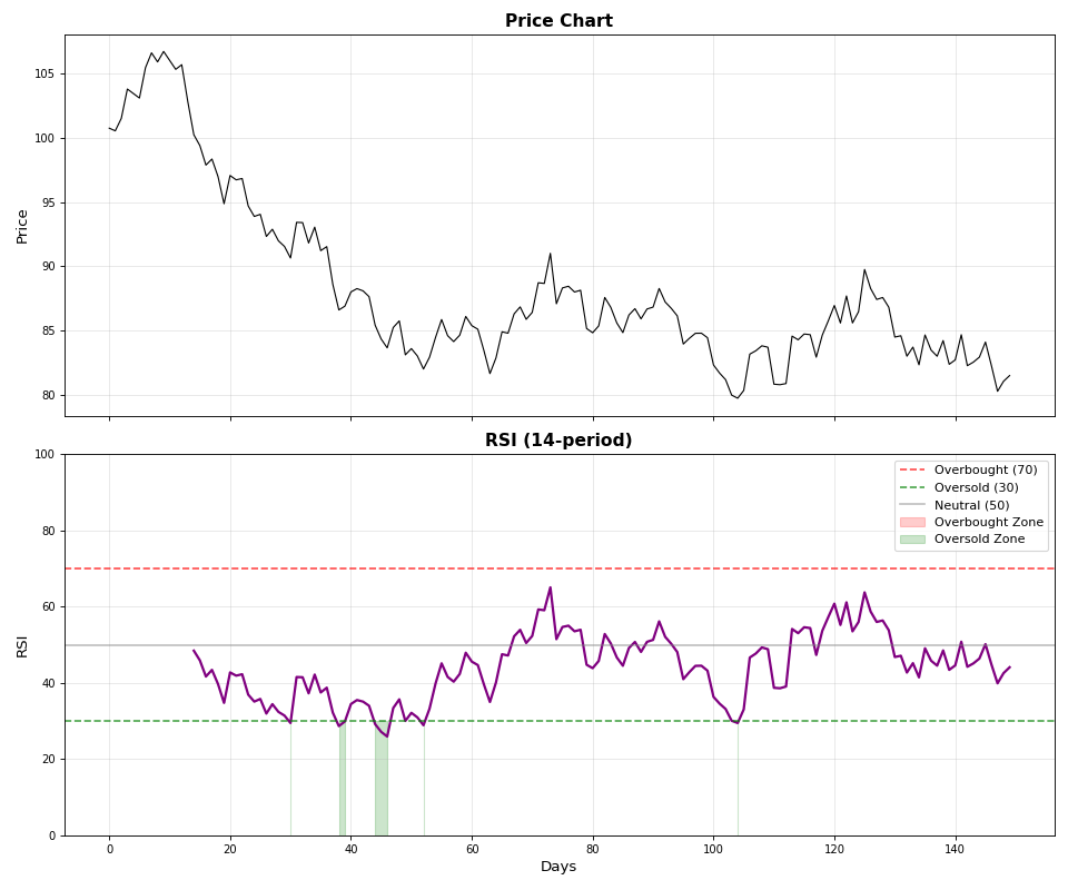
RSI Overbought/Oversold Analysis
import numpy as np
import matplotlib.pyplot as plt
import sys
sys.path.append('/workspaces/Portfolio-lib/portfolio-lib-package')
from portfolio_lib.indicators import TechnicalIndicators

# Generate volatile price data
np.random.seed(42)
prices = 100 + np.cumsum(np.random.randn(150) * 1.5)
rsi = TechnicalIndicators.rsi(prices, 14)

# Create subplots
fig, (ax1, ax2) = plt.subplots(2, 1, figsize=(12, 10), sharex=True)

# Price chart
ax1.plot(prices, color='black', linewidth=1)
ax1.set_title('Price Chart', fontsize=14, fontweight='bold')
ax1.set_ylabel('Price', fontsize=12)
ax1.grid(True, alpha=0.3)

# RSI chart
ax2.plot(rsi, color='purple', linewidth=2)
ax2.axhline(y=70, color='red', linestyle='--', alpha=0.7, label='Overbought (70)')
ax2.axhline(y=30, color='green', linestyle='--', alpha=0.7, label='Oversold (30)')
ax2.axhline(y=50, color='gray', linestyle='-', alpha=0.5, label='Neutral (50)')

# Fill overbought/oversold areas
ax2.fill_between(range(len(rsi)), 70, 100, where=(rsi >= 70), alpha=0.2, color='red', label='Overbought Zone')
ax2.fill_between(range(len(rsi)), 0, 30, where=(rsi <= 30), alpha=0.2, color='green', label='Oversold Zone')

ax2.set_title('RSI (14-period)', fontsize=14, fontweight='bold')
ax2.set_xlabel('Days', fontsize=12)
ax2.set_ylabel('RSI', fontsize=12)
ax2.set_ylim(0, 100)
ax2.legend(fontsize=10)
ax2.grid(True, alpha=0.3)

plt.tight_layout()
plt.show()
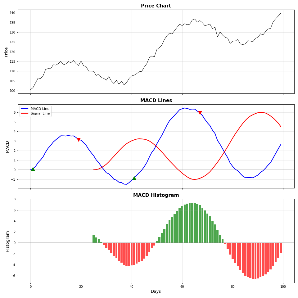
MACD Signal Analysis
import numpy as np
import matplotlib.pyplot as plt
import sys
sys.path.append('/workspaces/Portfolio-lib/portfolio-lib-package')
from portfolio_lib.indicators import TechnicalIndicators

# Generate trending price data
np.random.seed(42)
base_trend = np.linspace(100, 140, 100)
cycle = 10 * np.sin(np.linspace(0, 4*np.pi, 100))
noise = np.random.normal(0, 1, 100)
prices = base_trend + cycle + noise

# Calculate MACD
macd_line, signal_line, histogram = TechnicalIndicators.macd(prices)

# Create subplots
fig, (ax1, ax2, ax3) = plt.subplots(3, 1, figsize=(12, 12), sharex=True)

# Price chart
ax1.plot(prices, color='black', linewidth=1)
ax1.set_title('Price Chart', fontsize=14, fontweight='bold')
ax1.set_ylabel('Price', fontsize=12)
ax1.grid(True, alpha=0.3)

# MACD Lines
ax2.plot(macd_line, color='blue', linewidth=2, label='MACD Line')
ax2.plot(signal_line, color='red', linewidth=2, label='Signal Line')
ax2.axhline(y=0, color='gray', linestyle='-', alpha=0.5)

# Highlight crossovers
macd_clean = macd_line[~np.isnan(macd_line)]
signal_clean = signal_line[~np.isnan(signal_line)]
min_len = min(len(macd_clean), len(signal_clean))

if min_len > 1:
    for i in range(1, min_len):
        if macd_clean[i] > signal_clean[i] and macd_clean[i-1] <= signal_clean[i-1]:
            ax2.scatter(i, macd_clean[i], color='green', s=100, marker='^', zorder=5)
        elif macd_clean[i] < signal_clean[i] and macd_clean[i-1] >= signal_clean[i-1]:
            ax2.scatter(i, macd_clean[i], color='red', s=100, marker='v', zorder=5)

ax2.set_title('MACD Lines', fontsize=14, fontweight='bold')
ax2.set_ylabel('MACD', fontsize=12)
ax2.legend(fontsize=10)
ax2.grid(True, alpha=0.3)

# MACD Histogram
colors = ['green' if h >= 0 else 'red' for h in histogram]
ax3.bar(range(len(histogram)), histogram, color=colors, alpha=0.7, width=0.8)
ax3.axhline(y=0, color='gray', linestyle='-', alpha=0.5)
ax3.set_title('MACD Histogram', fontsize=14, fontweight='bold')
ax3.set_xlabel('Days', fontsize=12)
ax3.set_ylabel('Histogram', fontsize=12)
ax3.grid(True, alpha=0.3)

plt.tight_layout()
plt.show()
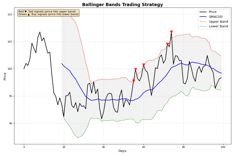
Bollinger Bands Strategy
import numpy as np
import matplotlib.pyplot as plt
import sys
sys.path.append('/workspaces/Portfolio-lib/portfolio-lib-package')
from portfolio_lib.indicators import TechnicalIndicators

# Generate mean-reverting price data
np.random.seed(42)
mean_price = 100
prices = [mean_price]

for i in range(99):
    reversion = 0.1 * (mean_price - prices[-1])
    noise = np.random.normal(0, 2)
    new_price = prices[-1] + reversion + noise
    prices.append(new_price)

prices = np.array(prices)

# Calculate Bollinger Bands
upper, middle, lower = TechnicalIndicators.bollinger_bands(prices, 20, 2)

# Create the plot
fig, ax = plt.subplots(figsize=(12, 8))

# Plot Bollinger Bands
ax.plot(prices, color='black', linewidth=2, label='Price')
ax.plot(middle, color='blue', linewidth=2, label='SMA(20)')
ax.plot(upper, color='red', linewidth=1, linestyle='--', label='Upper Band')
ax.plot(lower, color='green', linewidth=1, linestyle='--', label='Lower Band')

# Fill between bands
ax.fill_between(range(len(prices)), upper, lower, alpha=0.1, color='gray')

# Mark trading signals
for i in range(20, len(prices)):
    if not np.isnan(upper[i]) and not np.isnan(lower[i]):
        if prices[i] >= upper[i]:
            ax.scatter(i, prices[i], color='red', s=100, marker='v', zorder=5, alpha=0.8)
        elif prices[i] <= lower[i]:
            ax.scatter(i, prices[i], color='green', s=100, marker='^', zorder=5, alpha=0.8)

# Calculate band width for squeeze detection
band_width = (upper - lower) / middle
squeeze_threshold = np.nanpercentile(band_width, 20)  # Bottom 20%

ax.set_title('Bollinger Bands Trading Strategy', fontsize=16, fontweight='bold')
ax.set_xlabel('Days', fontsize=12)
ax.set_ylabel('Price', fontsize=12)
ax.legend(fontsize=12)
ax.grid(True, alpha=0.3)

# Add annotations
ax.text(0.02, 0.98, f'Red ▼: Sell signals (price hits upper band)\nGreen ▲: Buy signals (price hits lower band)',
        transform=ax.transAxes, fontsize=10, verticalalignment='top',
        bbox=dict(boxstyle='round', facecolor='wheat', alpha=0.8))

plt.tight_layout()
plt.show()
Portfolio Analytics Visualization
Risk-Return Scatter Plot
import numpy as np
import matplotlib.pyplot as plt

# Simulate multiple portfolio strategies
np.random.seed(42)
n_strategies = 20

# Generate risk-return data for different strategies
returns = np.random.uniform(0.05, 0.20, n_strategies)  # 5% to 20% annual returns
volatilities = np.random.uniform(0.08, 0.25, n_strategies)  # 8% to 25% volatility

# Add some correlation between risk and return
returns = returns + 0.3 * (volatilities - np.mean(volatilities))

# Calculate Sharpe ratios
risk_free_rate = 0.03
sharpe_ratios = (returns - risk_free_rate) / volatilities

# Create the plot
fig, ax = plt.subplots(figsize=(12, 8))

# Color points by Sharpe ratio
scatter = ax.scatter(volatilities, returns, c=sharpe_ratios, s=100,
                    cmap='RdYlGn', alpha=0.7, edgecolors='black', linewidth=1)

# Add efficient frontier curve
efficient_vol = np.linspace(0.08, 0.25, 50)
efficient_ret = 0.03 + 0.4 * efficient_vol + 0.2 * efficient_vol**2
ax.plot(efficient_vol, efficient_ret, 'b--', linewidth=2, alpha=0.7, label='Efficient Frontier')

# Mark special portfolios
market_idx = np.argmin(np.abs(volatilities - 0.15))  # Market portfolio
min_vol_idx = np.argmin(volatilities)  # Minimum volatility
max_sharpe_idx = np.argmax(sharpe_ratios)  # Maximum Sharpe

ax.scatter(volatilities[market_idx], returns[market_idx],
          color='blue', s=200, marker='*', label='Market Portfolio', zorder=5)
ax.scatter(volatilities[min_vol_idx], returns[min_vol_idx],
          color='green', s=200, marker='s', label='Min Volatility', zorder=5)
ax.scatter(volatilities[max_sharpe_idx], returns[max_sharpe_idx],
          color='red', s=200, marker='D', label='Max Sharpe', zorder=5)

# Add colorbar
cbar = plt.colorbar(scatter)
cbar.set_label('Sharpe Ratio', fontsize=12)

# Styling
ax.set_title('Risk-Return Analysis of Portfolio Strategies', fontsize=16, fontweight='bold')
ax.set_xlabel('Volatility (Risk)', fontsize=12)
ax.set_ylabel('Expected Return', fontsize=12)
ax.legend(fontsize=10)
ax.grid(True, alpha=0.3)

# Format axes as percentages
ax.xaxis.set_major_formatter(plt.FuncFormatter(lambda x, p: f'{x:.0%}'))
ax.yaxis.set_major_formatter(plt.FuncFormatter(lambda x, p: f'{x:.0%}'))

plt.tight_layout()
plt.show()
Drawdown Analysis
import numpy as np
import matplotlib.pyplot as plt
import sys
sys.path.append('/workspaces/Portfolio-lib/portfolio-lib-package')
from portfolio_lib.portfolio import AdvancedPortfolioAnalytics

# Simulate portfolio returns with drawdown periods
np.random.seed(42)

# Create realistic return series with volatility clustering
returns = []
vol = 0.15  # Starting volatility

for i in range(252):  # One year of daily returns
    # GARCH-like volatility
    vol = 0.95 * vol + 0.05 * 0.15 + 0.1 * abs(returns[-1] if returns else 0)
    ret = np.random.normal(0.0008, vol / np.sqrt(252))  # Daily return
    returns.append(ret)

returns = np.array(returns)
equity_curve = np.cumprod(1 + returns)

# Calculate drawdowns
peak = np.maximum.accumulate(equity_curve)
drawdown = (equity_curve - peak) / peak

# Create the plot
fig, (ax1, ax2) = plt.subplots(2, 1, figsize=(12, 10), sharex=True)

# Equity curve
ax1.plot(equity_curve, color='blue', linewidth=2, label='Portfolio Value')
ax1.plot(peak, color='red', linestyle='--', alpha=0.7, label='Running Peak')
ax1.set_title('Portfolio Equity Curve', fontsize=14, fontweight='bold')
ax1.set_ylabel('Portfolio Value', fontsize=12)
ax1.legend(fontsize=10)
ax1.grid(True, alpha=0.3)

# Drawdown chart
ax2.fill_between(range(len(drawdown)), drawdown, 0, alpha=0.3, color='red')
ax2.plot(drawdown, color='red', linewidth=1)
ax2.set_title('Drawdown Analysis', fontsize=14, fontweight='bold')
ax2.set_xlabel('Days', fontsize=12)
ax2.set_ylabel('Drawdown', fontsize=12)
ax2.grid(True, alpha=0.3)

# Format y-axis as percentage
ax2.yaxis.set_major_formatter(plt.FuncFormatter(lambda x, p: f'{x:.1%}'))

# Add statistics
analytics = AdvancedPortfolioAnalytics(returns)
max_dd, duration, max_dd_idx = analytics.calculate_maximum_drawdown(equity_curve)

# Mark maximum drawdown
ax2.scatter(max_dd_idx, max_dd, color='darkred', s=100, zorder=5)
ax2.annotate(f'Max DD: {max_dd:.1%}\\nDuration: {duration} days',
             xy=(max_dd_idx, max_dd), xytext=(max_dd_idx + 30, max_dd + 0.01),
             arrowprops=dict(arrowstyle='->', color='darkred'),
             fontsize=10, ha='left')

plt.tight_layout()
plt.show()
Risk Metrics Dashboard
import numpy as np
import matplotlib.pyplot as plt
import sys
sys.path.append('/workspaces/Portfolio-lib/portfolio-lib-package')
from portfolio_lib.portfolio import AdvancedPortfolioAnalytics

# Generate sample returns for multiple strategies
np.random.seed(42)
strategies = ['Conservative', 'Balanced', 'Aggressive', 'Market Neutral', 'High Frequency']

# Different return profiles
strategy_params = {
    'Conservative': (0.0003, 0.008),    # Low return, low vol
    'Balanced': (0.0005, 0.015),        # Medium return, medium vol
    'Aggressive': (0.0008, 0.025),      # High return, high vol
    'Market Neutral': (0.0002, 0.005),  # Very low return and vol
    'High Frequency': (0.0001, 0.003)   # Very low vol, minimal return
}

metrics_data = {}

for strategy, (daily_ret, daily_vol) in strategy_params.items():
    returns = np.random.normal(daily_ret, daily_vol, 252)
    equity_curve = np.cumprod(1 + returns)
    analytics = AdvancedPortfolioAnalytics(returns)

    # Calculate key metrics
    annual_return = np.mean(returns) * 252
    annual_vol = np.std(returns) * np.sqrt(252)
    sharpe = annual_return / annual_vol if annual_vol > 0 else 0
    max_dd, _, _ = analytics.calculate_maximum_drawdown(equity_curve)
    var_95 = analytics.calculate_var(0.05)

    metrics_data[strategy] = {
        'Return': annual_return,
        'Volatility': annual_vol,
        'Sharpe': sharpe,
        'Max DD': abs(max_dd),
        'VaR 95%': abs(var_95)
    }

# Create dashboard
fig, axes = plt.subplots(2, 3, figsize=(18, 12))
fig.suptitle('Portfolio Risk Metrics Dashboard', fontsize=20, fontweight='bold')

metrics = ['Return', 'Volatility', 'Sharpe', 'Max DD', 'VaR 95%']
colors = ['green', 'orange', 'blue', 'red', 'purple']

for i, metric in enumerate(metrics):
    if i < 5:  # We have 6 subplots, use 5
        ax = axes[i//3, i%3]
        values = [metrics_data[strategy][metric] for strategy in strategies]

        bars = ax.bar(strategies, values, color=colors[i], alpha=0.7, edgecolor='black')
        ax.set_title(f'{metric}', fontsize=14, fontweight='bold')
        ax.tick_params(axis='x', rotation=45)
        ax.grid(True, alpha=0.3, axis='y')

        # Format y-axis based on metric type
        if metric in ['Return', 'Volatility', 'Max DD', 'VaR 95%']:
            ax.yaxis.set_major_formatter(plt.FuncFormatter(lambda x, p: f'{x:.1%}'))

        # Add value labels on bars
        for bar, value in zip(bars, values):
            height = bar.get_height()
            if metric in ['Return', 'Volatility', 'Max DD', 'VaR 95%']:
                label = f'{value:.1%}'
            else:
                label = f'{value:.2f}'
            ax.text(bar.get_x() + bar.get_width()/2., height + max(values)*0.01,
                   label, ha='center', va='bottom', fontsize=10)

# Use the last subplot for a summary table
ax = axes[1, 2]
ax.axis('off')

# Create table data
table_data = []
for strategy in strategies:
    row = [strategy]
    for metric in ['Return', 'Volatility', 'Sharpe']:
        value = metrics_data[strategy][metric]
        if metric in ['Return', 'Volatility']:
            row.append(f'{value:.1%}')
        else:
            row.append(f'{value:.2f}')
    table_data.append(row)

# Create table
table = ax.table(cellText=table_data,
                colLabels=['Strategy', 'Return', 'Volatility', 'Sharpe'],
                cellLoc='center',
                loc='center',
                bbox=[0, 0, 1, 1])

table.auto_set_font_size(False)
table.set_fontsize(10)
table.scale(1, 2)

# Style the table
for i in range(len(strategies) + 1):
    for j in range(4):
        cell = table[(i, j)]
        if i == 0:  # Header
            cell.set_facecolor('#4CAF50')
            cell.set_text_props(weight='bold', color='white')
        else:
            cell.set_facecolor('#f0f0f0')

ax.set_title('Summary Statistics', fontsize=14, fontweight='bold')

plt.tight_layout()
plt.show()
Mathematical Formulas Reference
Key Technical Indicator Formulas
Indicator |
Formula |
Description |
|---|---|---|
Simple Moving Average |
\(SMA_t = \frac{1}{n} \sum_{i=0}^{n-1} P_{t-i}\) |
Average of last n prices |
Exponential Moving Average |
\(EMA_t = \alpha P_t + (1-\alpha) EMA_{t-1}\) where \(\alpha = \frac{2}{n+1}\) |
Weighted average giving more weight to recent prices |
Relative Strength Index |
\(RSI = 100 - \frac{100}{1 + RS}\) where \(RS = \frac{Avg Gain}{Avg Loss}\) |
Momentum oscillator (0-100) |
MACD |
\(MACD = EMA_{fast} - EMA_{slow}\) |
Trend-following momentum indicator |
Bollinger Bands |
\(Upper = SMA + (k \times \sigma)\), \(Lower = SMA - (k \times \sigma)\) |
Volatility bands around moving average |
Stochastic %K |
\(\%K = 100 \times \frac{C - L_n}{H_n - L_n}\) |
Position within recent price range |
Williams %R |
\(\%R = -100 \times \frac{H_n - C}{H_n - L_n}\) |
Inverted stochastic oscillator |
Average True Range |
\(ATR = SMA(TR)\) where \(TR = \max(H-L, |H-C_{prev}|, |L-C_{prev}|)\) |
Measure of volatility |
Portfolio Risk Metrics Formulas
Metric |
Formula |
Description |
|---|---|---|
Value at Risk (VaR) |
\(VaR_\alpha = -\inf\{x : P(X \leq x) \geq \alpha\}\) |
Maximum loss at confidence level α |
Conditional VaR (CVaR) |
\(CVaR_\alpha = E[X | X \leq VaR_\alpha]\) |
Expected loss beyond VaR |
Maximum Drawdown |
\(MDD = \max_{t \in [0,T]} \left[ \frac{Peak_t - Valley_t}{Peak_t} \right]\) |
Largest peak-to-trough decline |
Sharpe Ratio |
\(SR = \frac{E[R_p] - R_f}{\sigma_p}\) |
Risk-adjusted return measure |
Beta |
\(\beta = \frac{Cov(R_p, R_m)}{Var(R_m)}\) |
Systematic risk measure |
Alpha |
\(\alpha = E[R_p] - (R_f + \beta(E[R_m] - R_f))\) |
Risk-adjusted excess return |
Tracking Error |
\(TE = \sigma(R_p - R_b)\) |
Volatility of excess returns |
Information Ratio |
\(IR = \frac{E[R_p - R_b]}{TE}\) |
Risk-adjusted active return |
Position Sizing Formulas
Method |
Formula |
Description |
|---|---|---|
Kelly Criterion |
\(f^* = \frac{bp - q}{b}\) where b=odds, p=win prob, q=loss prob |
Optimal fraction for maximum growth |
Fixed Fractional |
\(Position = \frac{Account \times Risk\%}{Stop Loss\%}\) |
Fixed percentage risk per trade |
Volatility Targeting |
\(Leverage = \frac{Target Vol}{Asset Vol}\) |
Scale position based on volatility |
Risk Parity |
\(w_i \times (Cov \times w)_i = \frac{\sigma_p}{n}\) for all i |
Equal risk contribution from each asset |
Performance Attribution Formulas
Component |
Formula |
Description |
|---|---|---|
Allocation Effect |
\((w_p - w_b) \times r_b\) |
Impact of weight differences |
Selection Effect |
\(w_b \times (r_p - r_b)\) |
Impact of security selection |
Interaction Effect |
\((w_p - w_b) \times (r_p - r_b)\) |
Combined allocation and selection |
Total Attribution |
\(Allocation + Selection + Interaction\) |
Sum of all attribution effects |
where: - \(w_p, w_b\) = Portfolio and benchmark weights - \(r_p, r_b\) = Portfolio and benchmark returns - \(\sigma\) = Standard deviation - \(n\) = Number of periods or assets - \(Cov\) = Covariance matrix